Creating a website is exciting — but if you’ve ever looked at your pages and thought, “It just doesn’t look quite right,” you’re definitely not alone.
The good news? You don’t need a designer, a big budget, or a brand-new theme to make your website look more professional.
You just need a few simple tweaks that help visitors feel comfortable exploring what you do.
Let’s walk through them one step at a time.
1. Keep It Clean and Simple
A clean, simple design isn’t just easier on the eyes — it’s one of the biggest secrets behind professional-looking websites. When everything feels calm and organised, visitors can find what they’re looking for without any effort.
Whitespace (or “empty” space) is your best friend here. It’s not wasted space — it helps important things stand out.
When your text, images, and buttons have room to breathe, your site instantly looks tidier and easier to read.

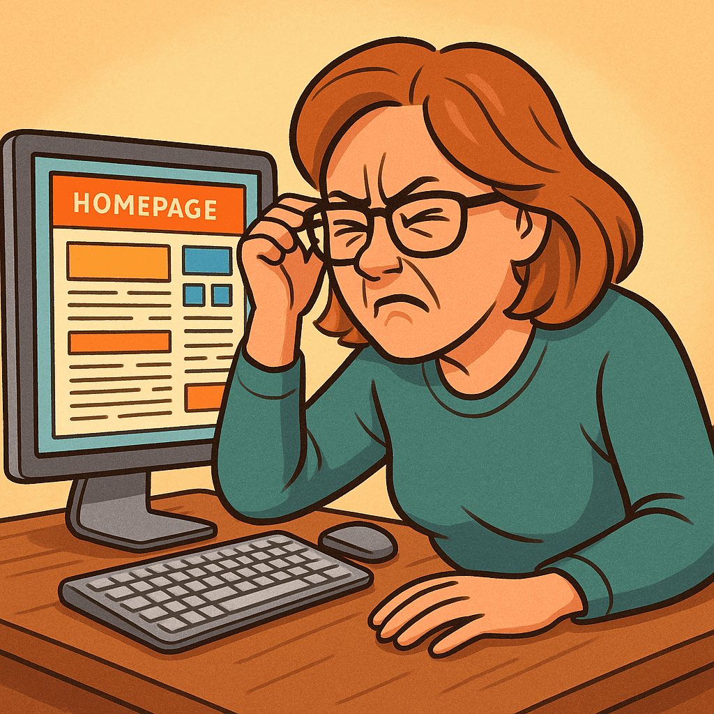
Try doing this: Open your homepage and squint a little. If it feels crowded or “busy,” you may need more space between sections or less text in one place.
2. Choose Colours That Work Together
Colours can change how people feel about your site. Soft, balanced tones create a calm and trustworthy atmosphere; too many bright or clashing colours can feel overwhelming.
Start with two or three complementary shades and stick to them throughout your site — one for headings, one for links or accents, and one neutral background colour.
Think of it like decorating a room: fewer, well-chosen colours create harmony.
If you want your site to feel warm and friendly, try muted blues, greens, or soft neutrals. You don’t need neon buttons to get attention — clarity always beats noise when you want to make your website look more professional.
3. Pick Fonts That Are Easy to Read
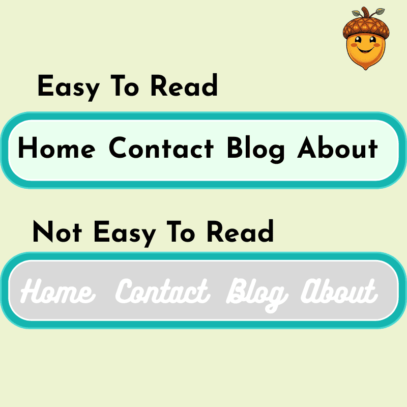
Fonts are the quiet heroes of your design. A fancy script might look fun, but if your reader has to squint, they’ll give up before they finish a sentence.
Choose one main font for your text and one for your headings — that’s it.
Stick with simple, readable options like Arial, Lato, or Open Sans.
Consistency helps make your website look more professional because visitors notice patterns more than design rules. When everything feels tidy and predictable, they relax — and stay longer.

4. Write Clear, Honest Content
No matter how pretty a site looks, your words are what build trust.
Your content should sound like you — clear, friendly, and easy to follow. Keep sentences short. Use subheadings to break things up. And always write as if you’re talking to one person, not an audience of thousands.
High-quality, genuine content makes your website look more professional because it reflects care and confidence.
If writing feels overwhelming, start with one page at a time:
- Your homepage: who you are and how you help
- Your About page: your story and what you stand for
- Your Blog: practical, simple advice your audience can act on
Tip: Use at least one clear image per page. A relevant photo or illustration helps people feel at ease and adds visual interest.
5. Focus on Function: Easy Navigation and Speed
A website isn’t just what people see — it’s how it feels to use.
Your visitors should find what they need quickly. Keep your top menu simple:
Home | About | Blog | Contact
If someone gets lost, they’ll leave — not because they don’t like your content, but because they couldn’t find it.
Speed also matters. Large images or too many plugins can slow things down, especially on mobile phones. Compress your images in Canva or TinyPNG and test your site on your phone — does it load within a few seconds?
Making your site easy to use is one of the fastest ways to make your website look more professional — it shows respect for your visitor’s time.
6. Add Small Personal Touches
Professional doesn’t mean cold or corporate.
Your visitors want to feel that there’s a real person behind the screen.
Add a friendly photo of yourself, a calm colour palette that reflects your personality, or a short welcome message on your homepage. These small touches make a big difference.
Think of your site as a friendly workspace — neat, approachable, and authentically yours.
And Finally...
Which part of your website (or mine) do you think could look more polished — your layout, your colours, or your writing?
Share your thoughts or questions in the comments below — you might inspire someone else who’s just starting their own refresh!
Here’s a little transparency: My website contains affiliate links. This means if you click and make a purchase, I may receive a small commission. Don’t worry, there’s no extra cost to you. It’s a simple way you can support my mission to bring you quality content.

