How to Check Your Own Website

How to Check Your Own Website

If you have a website, it’s natural to wonder whether it’s doing what you hoped it would do.

Many people worry that “checking” a website means technical tests, special tools, or judging themselves harshly. It doesn’t.

In this guide, we’ll look at how to check your own website in a calm, practical way — without jargon, pressure, or fear of doing something wrong.

You don’t need technical knowledge.
You don’t need to change anything today.
You’re simply taking a gentle look.

What Does It Mean To Check Your Own Website?

Before we go any further, let’s slow this right down.

When people talk about checking a website, they often use words like audit or performance. Those words can sound intimidating.

In plain terms, to check your own website simply means:

  • looking at it with fresh eyes

  • noticing what feels clear

  • noticing what feels confusing

Thoughts on website | how to check your own website

Think of it like walking through your own home as if you were visiting for the first time. You’re not judging. You’re just noticing.

This kind of gentle check is often called “how to audit your website for free” online — but really, it’s just paying calm attention.

Why Checking Your Website Can Feel Uncomfortable

Many midlife and older adults worry they’ll “break something” or discover mistakes.

That feeling is very common — and very human.

If you didn’t grow up with the internet, websites can feel permanent or fragile, as if one wrong move might undo everything. In reality, most website checks involve no changes at all.

You’re allowed to look.
You’re allowed to be unsure.
Nothing bad happens just because you notice something.

Understanding this helps make checking your own website feel safer and more manageable.

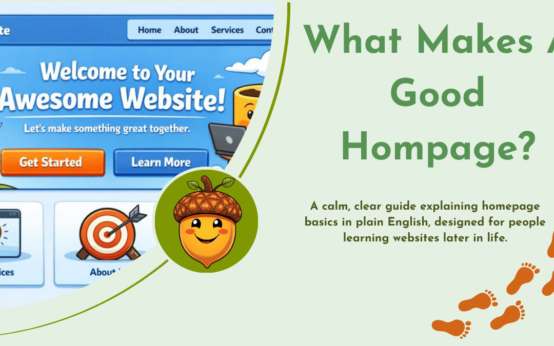
Start With The Homepage

If you’re going to check one place, start with your homepage.

Your homepage is like the front door of your website. It doesn’t need to explain everything — it just needs to help people feel oriented.

When you look at it, ask yourself:

  • Is it clear what this site is about?

  • Is it clear who it’s for?

  • Is it clear what someone can do next?

If you can answer those questions easily, you’re already doing well.

This step alone is a big part of how to check your own website work.

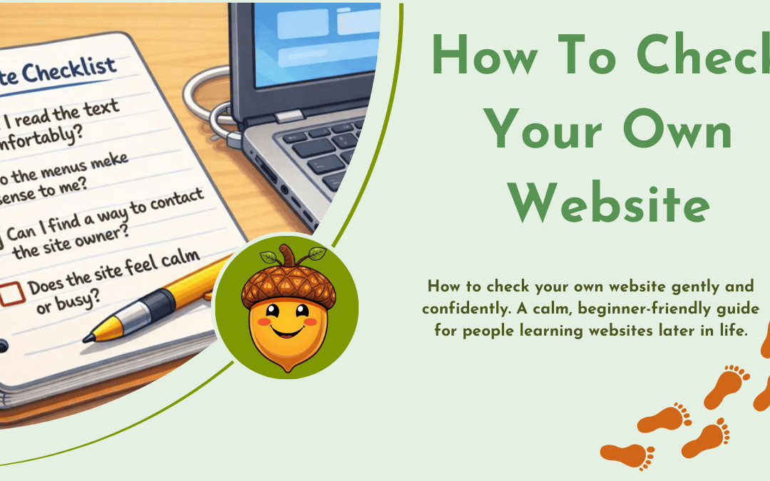
A Simple Checklist You Can Use

Instead of a formal “website audit checklist”, here’s a short, gentle list you can work through.

Take your time. You don’t need to answer everything.

  • Can I read the text comfortably?

  • Do the menus make sense to me?

  • Can I find a way to contact the site owner?

  • Does the site feel calm or busy?

Checklist | check your own website

This kind of list helps you check your own website without turning it into a test.

There are no right or wrong answers — only observations.

Checking Your Website Performance Without Numbers

You may hear people talk about “checking your website performance”.

For beginners, this does not mean speed scores, graphs, or technical results.

In human terms, performance simply means:

  • Does the site load without fuss?

  • Does it feel steady rather than jumpy?

  • Can someone move around without getting lost?

If the site feels calm and usable to you, that’s a strong sign.

This approach keeps checking your own website grounded in real experience, not statistics.

What You Can Leave Alone For Now

One of the most important parts of checking a website is knowing what you don’t need to touch.

You can safely ignore:

  • technical settings

  • advanced tools

  • design trends

  • anything you don’t understand yet

Learning later in life works best when you protect your confidence.

If something feels too much, it’s perfectly fine to leave it for another day. That, too, is part of learning how to check your own website simply.

Learning At Your Own Pace

Some people like to learn website basics with structured, step-by-step guidance rather than guessing their way through.

For example, Wealthy Affiliate is one platform that teaches websites slowly and clearly, without assuming technical knowledge. It’s not something you have to use — but for some learners, having everything explained in order can feel reassuring.

What matters most is choosing a pace that suits you, not the internet.

If you’d like to learn more about the internet (for beginners) I have written more on the subject HERE

And Finally…

If checking your website has ever felt daunting, I hope this guide has made it feel a little more approachable.

You don’t need to fix everything.
You don’t need to be confident yet.
You’re allowed to learn slowly.

If you’d like to share:

  • what felt unclear

  • or what you’d like help understanding next

you’re very welcome to leave a comment.
There are no silly questions — and no pressure to respond.

Here’s a little transparency:
My website contains affiliate links. This means if you click and make a purchase, I may receive a small commission. Don’t worry, there’s no extra cost to you. It’s a simple way you can support my mission to bring you quality content.

What Makes a Good Homepage?

What Makes a Good Homepage?

If you have a website, your homepage is often the first thing people see.
It’s a bit like the front door of a house.

A good front door doesn’t explain everything inside.
It simply helps people feel welcome and shows them where to go next.

In this post, we’ll look calmly and clearly at what makes a good homepage, without jargon or pressure.
There’s no rush. You don’t need to know anything technical to follow along.

What Is A Homepage, Really?

Before we talk about what makes a good homepage, it helps to be clear about what a homepage actually is.

A homepage is the main page of a website.
It’s the page people usually arrive on first, either from a search engine or a link.

Think of it like:

  • the cover of a book

  • a shop window

  • or a simple map at the entrance to a park

Its job is not to explain everything.
Its job is to help people decide where to go next.

A good homepage answers three quiet questions in the reader’s mind:

  • Where am I?

  • Is this for me?

  • What can I do next?

What Makes A Good Homepage?

So, what makes a good homepage work well for real people?

At its heart, a good homepage is calm and clear.
It doesn’t shout. It doesn’t rush. It doesn’t try to be clever.

Instead, it:

  • explains what the site is about

  • helps visitors feel safe and oriented

  • offers clear next steps

When people talk about effective homepage design, they usually mean something very simple:
a homepage that helps visitors find their way without effort or confusion.

That’s it.

What makes a goof homepage  | Homescreen

The Key Elements Of A Homepage

Let’s look at the key elements of a homepage, one at a time.

You don’t need all of these perfectly in place.
Even having a few of them makes a difference.

1. A clear opening message

Near the top of your homepage, people should be able to tell:

  • what your website is about

  • who it is for

This doesn’t need fancy wording.

Plain language works best.
Imagine explaining your site to someone you’ve just met.

If visitors have to guess, they often leave.

What makes a homepage effective | clear homescreen<br />

2. A calm sense of direction

A good homepage gently guides people.

This might be:

  • a menu at the top

  • a few clear links

  • or short sections pointing to different parts of the site

You’re not pushing people.
You’re simply saying, “Here are a few places you might like to go.”

This is an important part of what makes a good homepage — helping visitors feel they’re in control.

3. Reassurance and trust

Many visitors, especially those who didn’t grow up with the internet, feel cautious online.

A good homepage quietly reassures them.

This might include:

  • a short sentence about who runs the site

  • a friendly photo

  • clear contact details

  • an explanation of what the site will (and won’t) do

Trust builds slowly.
A calm homepage helps that happen.

4. Simple layout, not clever design

When thinking about what makes a good homepage, layout matters more than decoration.

A sensible layout:

  • uses space so the page can breathe

  • avoids clutter

  • makes it easy to read on different screens

You don’t need moving parts, pop-ups, or clever tricks.
Clarity is far more helpful.

If you’re ever unsure, simpler is usually better.

What A Good Homepage Does Not Need

It’s just as helpful to know what you can safely leave out.

A good homepage does not need:

  • lots of technical language

  • everything you’ve ever written

  • constant updates

  • pressure or urgency

If your homepage feels calm to you, it will likely feel calm to your visitors too.
That’s a strong sign you’re on the right track.

This understanding is central to what makes a good homepage work for real people.

A Gentle Word About Building Websites

If you’re building or improving a website later in life, it’s normal to feel unsure.

You’re not behind.
You’re learning something new — and that takes time.

Some people choose structured platforms that explain things step by step.
For example, Wealthy Affiliate is one place that teaches website basics at a steady pace, without assuming technical knowledge. It isn’t for everyone, but some find the calm, guided approach reassuring.

What matters most is choosing a pace that suits you.

And Finally…

If you’ve been wondering what makes a good homepage, I hope this has helped things feel a little clearer.

You don’t need to change everything at once.
One small adjustment is enough for today.

If you’d like to share:

  • what part felt unclear

  • or what you’d like explained next

you’re very welcome to leave a comment.
There are no silly questions here — and you don’t need to rush.

If you’d like to learn some more about the internet I have some more articles that may help you HERE . Or have a look at this website by AgeUK which may help you. 

Here’s a little transparency:
My website contains affiliate links. This means if you click and make a purchase, I may receive a small commission. Don’t worry, there’s no extra cost to you. It’s a simple way you can support my mission to bring you quality content.

Wealthy Affiliate:A Calm, Honest Look for Small Business Beginners

Wealthy Affiliate:A Calm, Honest Look for Small Business Beginners

If you’re a small business owner who wants a clearer online presence, you may have come across Wealthy Affiliate.

It’s often described as an “all-in-one” platform for building websites and online income. That can sound appealing — and also a little overwhelming.

This review is written for people who:

  • are not especially technical

  • prefer to understand things before committing

  • want steady progress, not hype

I’ll explain what Wealthy Affiliate actually is, what it’s good at, and where it may not suit everyone.

I’ve been a member of Wealthy Affiliate since 2013.

I’m not someone who joined last week or promotes every platform I come across. I’ve used Wealthy Affiliate at different stages of my own learning, stepped away at times, and returned when I needed structure and clarity or help again.

This review is based on long-term use, not a quick first impression.

Who this review is for (and who it isn’t)

This review is for you if:

  • you already use the internet comfortably

  • you run (or plan to run) a small business

  • you want guidance, structure, and support

  • you prefer learning step by step

It may not suit you if:

  • you want fast results with little effort

  • you dislike reading or following structured lessons

  • you are looking for a “done-for-you” business

That distinction matters.

Lady on laptop | Wealthy Affiliate Review

What Wealthy Affiliate is — in plain English

Wealthy Affiliate is an online platform that brings together:

Instead of buying these separately, they are offered in one place.

The focus is on helping people learn how websites and online income work, rather than selling a shortcut or a system that runs on its own.

What it helps with most

For cautious beginners, Wealthy Affiliate is strongest in three areas.

1. Learning at a steady pace

The training is structured and guided. You’re not expected to “know things already”, and you move forward one lesson at a time.

2. Building a simple website

You can create a basic website without needing to understand technical details like hosting or servers. This is helpful if you want to focus on content, not setup.

Checklist | Wealthy Affiliate Review

3. Ongoing support

There is an active community where questions are answered quickly. For many people, this reassurance is just as important as the training itself.

There are also optional tools that can help with early writing and images. These are there to support you, not replace your own thinking.

For example, you can use writing assistance to help shape a first draft, or image tools to create gorgeous website visuals. Everything can be edited and adjusted, and you’re never forced to use them.

What feels reassuring for beginners

Several things tend to suit people who are careful and methodical:

  • You can start for free, with no payment details

  • There’s no rush to upgrade

  • You can explore the platform before deciding

  • Help is available when you get stuck

You are encouraged to learn properly, rather than being pushed forward.

What may feel challenging (honest drawbacks)

It’s important to be realistic.

Some people find:

  • the amount of information a bit overwhelming at first

  • the platform takes time to get used to

  • progress feels slow if you’re impatient

This is not a “quick win” approach. If you prefer gentle, steady learning, that can be a positive — but it’s not for everyone.  

Can be overwhelming | Wealthy Affiliate Review

How pricing works (calmly explained)

There are two levels,

  • Starter (free):
    Lets you try the training and build a basic website. This is the best place to begin.

  • Premium (paid):
    Adds full training, more websites, and extra tools. This is usually chosen once someone feels confident the platform suits them.

You are not locked in, and there’s no pressure to upgrade quickly.

My honest view

For small business owners who feel unsure about websites and online income, Wealthy Affiliate can be a safe place to learn.

It works best for people who:

  • value explanation over speed

  • want support while learning

  • are happy to take things one step at a time

It won’t suit everyone — and that’s fine. But for the right person, it can remove a lot of confusion and guesswork.

I’ve been a member of Wealthy Affiliate since 2013.
I mention this simply to be open about my experience. I’ve seen how the platform has changed over time, and I’ve used it at different stages of my own learning and continue to do so.

A gentle next step

If you’re someone who prefers to understand before committing, the free Starter membership is genuinely the best way to explore Wealthy Affiliate.

You don’t need to add your bank details, and you’re not pushed to upgrade. You can log in, follow the first lessons, and decide in your own time whether it feels right for you.

Click the image below for your free membership.

Promo 2

And Finally…

If I were starting again today

I would:

  • Start with the free Starter account

  • Ignore trying to “make money” at first

  • Focus on understanding how a simple website works

  • Use the community to ask beginner questions early

That approach would have saved me a lot of confusion in the early years.

If you’re unsure whether Wealthy Affiliate would suit you, you’re welcome to ask questions — either about this platform or about building a website more generally.

There are no silly questions, and there’s no rush.

How To Know If My Website Is Effective

How To Know If My Website Is Effective

If you’ve ever found yourself wondering “Is my website actually doing anything?”, you’re not alone. Many small business owners and beginners feel unsure whether their website is working for them or just sitting quietly online.

Learning how to know if my website is effective doesn’t require technical knowledge, complicated tools, or marketing jargon. It’s about understanding a few clear signs, asking the right questions, and giving yourself permission to keep things simple.

Start With Purpose: What Is Your Website Really For?

Every website starts off with a purpose, and getting clear on this from the start is like setting your North Star. Without it, a website can feel confusing — both for you and for your visitors.

Ask yourself:

  • Are you selling something?

  • Are you sharing information or teaching?

  • Are you building trust or community?

Website purpose acting as a guiding direction | How to Know if My Website Is Effective

If you’re trying to do everything, your website may struggle to do anything well. Clarity here makes it much easier to know if your website is effective, because you’re no longer guessing what success looks like.

A simple purpose statement can help:

This website exists to help beginners feel confident using the internet.

That’s not corporate jargon — it’s a gentle anchor that keeps everything aligned.

Know Your Visitors (And What They’re Looking For)

Understanding your visitors is one of the most important steps in learning how to know if my website is effective.

Think about who is landing on your site:

  • Are they beginners?

  • Are they feeling unsure or overwhelmed?

  • Are they looking for reassurance, not perfection?

If your visitors are hunting for clear explanations and calm guidance, and your site delivers that, then it is doing its job — even if your traffic numbers are small.

Effectiveness isn’t about volume. It’s about fit.

How to Know if My Website Is Effective Using Simple Signals

You don’t need to drown in statistics to understand what’s happening on your site. A few gentle signals can tell you a lot.

Here are some beginner-friendly indicators:

1. Are people staying on your pages?

If visitors leave immediately, something may feel confusing or overwhelming.

If they stay and read, that’s a good sign.

2. Are they taking small actions?

This could be:

  • reading more than one page

  • clicking a link

  • signing up for your email list

  • using a contact form

These are all signs your website is helping, not hindering.

3. Are you getting the right visitors?

Ten people who feel understood are more valuable than a hundred who feel lost.

This is a practical, pressure-free way of understanding how to know if my website is effective without chasing big numbers.

Using Metrics Without Stress (KPIs Explained Gently)

You may hear people talk about Key Performance Indicators (KPIs). That can sound intimidating, but it simply means things worth paying attention to — not things you have to obsess over.

For beginners, the most useful KPIs are very simple:

  • Traffic – Are people visiting your site at all?

  • Engagement – Do they stay and read, or leave straight away?

  • Conversions – Do they take one small next step, such as clicking a link or signing up for emails?

KPIs | How to know if my website is effective

You don’t need to track everything. Even noticing small changes over time can be enough to help you understand how your website is doing.

Tools like Google Analytics can show you how people move around your site, while Google Search Console can give you gentle insight into how people are finding you through Google. You don’t need to understand every chart or number — a quick look now and then is plenty.

If you prefer learning in a structured, step-by-step way, platforms like Wealthy Affiliate can be helpful, as they explain ideas like tracking and progress slowly, without assuming technical knowledge.

The goal isn’t to “get good at metrics” — it’s simply to feel a little more confident about what’s working and what’s not.

User Experience Matters More Than You Think

A website can only be effective if people feel comfortable using it.

Ask yourself:

  • Is the text easy to read?

  • Can visitors find what they need quickly?

  • Does the site work on phones and tablets?

Accessibility is part of effectiveness too. Clear headings, simple language, and calm design choices all help beginners feel welcome.

Search engine optimisation (SEO) fits here as well — not as a technical trick, but as a way of helping the right people find you. Using natural language and clear topics makes it easier for both humans and search engines to understand your site.

This is another key part of understanding how to know if my website is effective over time.

Real Progress Comes From Small Adjustments

No effective website started out perfect. The best sites grow by:

  • noticing what works

  • gently improving what doesn’t

  • listening to their audience

If your website helps even one person feel less confused, it is already effective. Everything else builds from there.

Remember: learning how to know if my website is effective is not about judgment — it’s about confidence.

Gradual progress | how to know if my website is effective

And Finally…

What made you start your website in the first place?

Are you trying to help, sell, share, or connect — or a mix of all four?
Have you noticed any small signs that your website is working, even if it doesn’t feel perfect yet?

If you’d like, share your thoughts in the comments.
You’re not behind — you’re learning, and that absolutely counts.

Here’s a little transparency: My website contains affiliate links. This means if you click and make a purchase, I may receive a small commission. Don’t worry, there’s no extra cost to you. It’s a simple way you can support my mission to bring you quality content.

6 Simple Ways to Make Your Website Look More Professional

6 Simple Ways to Make Your Website Look More Professional

Creating a website is exciting — but if you’ve ever looked at your pages and thought, “It just doesn’t look quite right,” you’re definitely not alone.
The good news? You don’t need a designer, a big budget, or a brand-new theme to make your website look more professional.

You just need a few simple tweaks that help visitors feel comfortable exploring what you do.

Let’s walk through them one step at a time.

1. Keep It Clean and Simple

A clean, simple design isn’t just easier on the eyes — it’s one of the biggest secrets behind professional-looking websites. When everything feels calm and organised, visitors can find what they’re looking for without any effort.

Whitespace (or “empty” space) is your best friend here. It’s not wasted space — it helps important things stand out.
When your text, images, and buttons have room to breathe, your site instantly looks tidier and easier to read.

Make Your Website Look More Professional | Squint

Try doing this:  Open your homepage and squint a little. If it feels crowded or “busy,” you may need more space between sections or less text in one place.

2. Choose Colours That Work Together

Colours can change how people feel about your site. Soft, balanced tones create a calm and trustworthy atmosphere; too many bright or clashing colours can feel overwhelming.

Start with two or three complementary shades and stick to them throughout your site — one for headings, one for links or accents, and one neutral background colour.

Think of it like decorating a room: fewer, well-chosen colours create harmony.

If you want your site to feel warm and friendly, try muted blues, greens, or soft neutrals. You don’t need neon buttons to get attention — clarity always beats noise when you want to make your website look more professional.

3. Pick Fonts That Are Easy to Read

Fonts are the quiet heroes of your design. A fancy script might look fun, but if your reader has to squint, they’ll give up before they finish a sentence.

Choose one main font for your text and one for your headings — that’s it.
Stick with simple, readable options like Arial, Lato, or Open Sans.

Consistency helps make your website look more professional because visitors notice patterns more than design rules. When everything feels tidy and predictable, they relax — and stay longer.

How To Add A Menu To Your Website | easy to read Horizontal Menu

4. Write Clear, Honest Content

No matter how pretty a site looks, your words are what build trust.

Your content should sound like you — clear, friendly, and easy to follow. Keep sentences short. Use subheadings to break things up. And always write as if you’re talking to one person, not an audience of thousands.

High-quality, genuine content makes your website look more professional because it reflects care and confidence.

If writing feels overwhelming, start with one page at a time:

  • Your homepage: who you are and how you help

  • Your About page: your story and what you stand for

  • Your Blog: practical, simple advice your audience can act on

Tip: Use at least one clear image per page. A relevant photo or illustration helps people feel at ease and adds visual interest.

5. Focus on Function: Easy Navigation and Speed

A website isn’t just what people see — it’s how it feels to use.

Your visitors should find what they need quickly. Keep your top menu simple:
Home | About | Blog | Contact

If someone gets lost, they’ll leave — not because they don’t like your content, but because they couldn’t find it.

Speed also matters. Large images or too many plugins can slow things down, especially on mobile phones. Compress your images in Canva or TinyPNG and test your site on your phone — does it load within a few seconds?

Making your site easy to use is one of the fastest ways to make your website look more professional — it shows respect for your visitor’s time.

6. Add Small Personal Touches

Professional doesn’t mean cold or corporate.
Your visitors want to feel that there’s a real person behind the screen.

Add a friendly photo of yourself, a calm colour palette that reflects your personality, or a short welcome message on your homepage. These small touches make a big difference.

Think of your site as a friendly workspace — neat, approachable, and authentically yours.

And Finally...

Which part of your website (or mine) do you think could look more polished — your layout, your colours, or your writing?
Share your thoughts or questions in the comments below — you might inspire someone else who’s just starting their own refresh!

Here’s a little transparency: My website contains affiliate links. This means if you click and make a purchase, I may receive a small commission. Don’t worry, there’s no extra cost to you. It’s a simple way you can support my mission to bring you quality content.

How to Choose a Website Name That People Remember

How to Choose a Website Name That People Remember

Creating your own website is exciting — but if you’ve ever sat staring at a blank screen wondering what on earth to call it, you’re definitely not alone.

Choosing a name can feel a bit like naming a pet or even a child — it’s something you’ll live with for years, so it needs to feel right. The good news is, you don’t need marketing jargon or a big brainstorming session.
You just need a clear process — and a calm mindset.

Let’s walk through how to choose a website name that feels comfortable, makes sense to your audience, and is easy to remember.

How to choose a website name

Step 1: Know Who You’re Naming It For

Before you start juggling potential website names, it helps to know who you’re aiming to connect with.

Think about the kinds of people you want to visit your site.
      Are they midlife learners dipping their toes into online business?
      Small business owners?
      Creative hobbyists?

Knowing your audience makes your naming decisions simpler and more meaningful.

You might be wondering why this matters. Well, the right name resonates with your readers and makes them feel that you’ve designed your space for them.

For example, a playful name might appeal to a younger crowd, while a steady, plain-English name feels more reassuring to professionals or older audiences who prefer clarity.

To understand your readers better, notice where they spend time online — perhaps in Facebook groups, forums, or communities around shared interests. You could even run a short survey to ask what types of names feel trustworthy to them.

When your website name fits the world they live in, they’re far more likely to remember it. It’s about speaking their language — even before they read a single post.

Think about well-known names like TechCrunch or BuzzFeed. You instantly know the type of audience they’re for — and that’s the power of choosing the right name.

Step 2: The Art of Simplicity — Crafting a Name That Sticks

When you’re learning how to choose a website name, simplicity is your best friend.

A short, clear name is easier to spell, say, and share. In a fast-paced online world, that matters.

Try focusing on brevity. Ask yourself:

“Could someone type this easily without asking me to spell it?”

If not, it’s probably too complicated.

Simple names can be powerful

Think of names like Netflix or Instagram — short, descriptive, and memorable.
They work because they convey meaning and sound natural.

In your case, simplicity might look like:

  • “Calm Crafting”

  • “Home Office Helper”

  • “Step by Step Websites”

They’re easy to say and give a sense of what you do without fuss.

The trick is to balance simplicity with personality. Don’t lose what makes your site unique just to be short. A clear name that reflects you will always win over something that’s trendy but confusing.

How to choose a website name | clarity

Step 3: Make Sure It Reflects What You Actually Do

Your visitors should be able to guess roughly what your site is about — even before they click.

If you teach, guide, or review products, hint at that in your name.
For example, Get Online Step by Step works because it instantly signals what kind of help readers will get.

When brainstorming, write down a few words that describe:

  • What you help people with

  • The tone you want (friendly, calm, expert, or playful)

  • The feeling you want to create (trust, curiosity, excitement, simplicity)

Then, combine one word from each column until something clicks.

Step 4: Check Availability Early

Before you fall in love with a name, make sure it’s not already taken as a domain name.
You can check availability easily using Namecheap or 123 Reg.

If your exact choice is taken, don’t panic — try small variations:

  • Add “online,” “guide,” or “by [YourName]”
  • Use a different domain ending (like .co.uk instead of .com)

Keeping your domain simple and tidy will make it easier for people to find and share your site.

Step 5: Add a Touch of Originality

The internet is crowded, so a little creativity can help you stand out.
But originality doesn’t mean overcomplicating things.

Think about wordplay or gentle puns that relate to your topic — just enough to spark curiosity.
A name like Grindstone Glories might suit a business blog, balancing hustle with optimism.

How to choose a website name | originality

The key is to make sure your name still gives a clue about what your site offers.
If it’s too mysterious, people won’t know what they’re clicking on — and search engines won’t either.

Keep SEO in mind: if possible, include a relevant word in your name, such as “crafts,” “blog,” “lessons,” or “wellness.” That helps both people and Google understand your focus.

Step 6: Say It Out Loud

Finally, test it with a friend or family member.
If they immediately understand what your site’s about and can repeat it back easily, you’re onto something good.

If they look puzzled or need you to spell it — it might be worth simplifying.

And Finally…

Learning how to choose a website name is less about perfection and more about connection.
It’s not about being clever — it’s about being clear.

Your website name should:

  • Feel natural when you say it
  • Make sense to your readers
  • Hint at your topic or purpose
  • Be easy to spell, type, and remember

Start simple, test it out, and remember: your name isn’t carved in stone.
What matters most is that it feels like you — friendly, human, and approachable.

For more information read this post

Over to You…
Have you found it tricky to name your website, or did the right idea come to you straight away? I’d love to hear what you’ve chosen — or what you’re still thinking about. Share your ideas or questions in the comments below. Your thoughts might just help someone else who’s stuck on the same step.

Here’s a little transparency: My website contains affiliate links. This means if you click and make a purchase, I may receive a small commission. Don’t worry, there’s no extra cost to you. It’s a simple way you can support my mission to bring you quality content.

What Should Be on a Small Business Website? (Even If You’re Just Starting Out)

What Should Be on a Small Business Website? (Even If You’re Just Starting Out)

Starting Simple: What Should Be On a Small Business Website?

If you’ve ever stared at a blank screen wondering what should be on a small business website, you’re not alone. Many small business owners — especially beginners — feel unsure about where to begin.

The good news? You don’t need pages and pages of content or complicated tech. Just a few clear, thoughtful sections can help visitors trust you, understand your business, and take the next step.

This guide walks you through the essentials — calmly, step by step.

1. A Clear and Friendly Homepage

Your homepage is like your shop window. It should tell visitors:

  • Who you are

  • What you do

  • Who you help

  • How to get in touch or buy from you

Don’t worry about fancy animations. Instead, focus on a short introduction and a simple call to action like “See My Services” or “Contact Me.”

Friendly homepage design on a small business website | What Should Be on a Small Business Website?

2. An “About” Page That Builds Trust

Jackie on about me page

People buy from people — so let them meet you!

Share your story, why you started, and who you love to work with. I have written a lesson on writing an ‘ About Me’ page.  It also comes with a video.  Check it out here

This isn’t bragging; it’s building connection.

A warm, honest “Aboutpage can do more than 10 social posts when it comes to trust.

3. A Services or Products Page

Make it easy to connect with you. Add:

  • Your email

  • A simple contact form

  • Optional: phone number or address

  • A map if you’re a physical location

Bonus tip: Add a friendly message like, “I usually reply within 24 hours!”

5. A Blog or Resource Section (Optional — But Powerful)

Not everyone needs a blog, but if you enjoy writing (or sharing helpful tips), it can be a fantastic way to:

  • Help your audience

  • Show your expertise

  • Improve your SEO

Even one or two posts can build trust. Need ideas? Try “5 Questions I Get Asked All the Time” or “How to Choose the Right [Your Product/Service].”

6. A Simple Menu and Mobile-Friendly Layout

Make sure visitors can find everything quickly. Your top menu should include:

  • Home

  • About

  • Services

  • Blog (if you have one)

  • Contact

Most WordPress themes handle this easily. If you’re not sure how, I’ve got a step-by-step post to help: How to Add a Menu to Your Website 

cartoon of a cell phone

But What About SEO, Themes, and All That Stuff?

Don’t worry — one step at a time. Once you’ve added the essentials above, you can start thinking about how your site looks (your theme) and how people find you (SEO).

If you’re still unsure what WordPress theme to use, this beginner-friendly guide might help:
10 Free WordPress Themes Perfect for Beginners

Or if you’d like more structured training and tools, I learned a lot from Wealthy Affiliate — a platform that walks you through everything from choosing a theme to growing your audience. Click here to find out more

Frequently Asked Question

1.  What is the most important page on a small business website?

For most visitors, your homepage is the most important page. It’s the shop window of your business. People should quickly see who you are, what you do, who you help, and how to get in touch. If your homepage feels clear and welcoming, they’ll want to look around the rest of your site.

2.  Do I need a blog if I run a small business?

Not every small business needs a blog. But a blog can be really powerful if you like sharing tips or answering customer questions. Even one or two useful posts can help people trust your expertise and make your site easier to find on Google. Think of it as a friendly way to start conversations with potential customers.

3. How many pages should a small business website have?

You don’t need dozens of pages. Most small business websites work well with 5–6 simple pages:

  • Home

  • About

  • Services or Products

  • Contact

  • Blog (optional)

It’s better to have a few clear, helpful pages than lots of half-finished ones. You can always add more later as your business grows.

6 Essentials Every Small Business Website Needs

And Finally…

Now you know what should be on a small business website — and it’s probably less than you feared!

Do you already have these pages on your site?
Which one do you want to focus on next?

Let me know in the comments — or send me a message if you’d like help with your next step.

Here’s a little transparency: My website contains affiliate links. This means if you click and make a purchase, I may receive a small commission. Don’t worry, there’s no extra cost to you. It’s a simple way you can support my mission to bring you quality content.

How To Use a WordPress Theme

How To Use a WordPress Theme

If you’re new to websites, the phrase “WordPress theme” might sound fancy or even intimidating. But the truth is, themes are simply the clothes your site wears—and picking one is the fun part!

In this guide, you’ll learn how to choose, install, customize, and care for your WordPress theme without needing any technical skills. Let’s walk through it step by step.

What Is a WordPress Theme?

A WordPress theme controls how your website looks — colours, fonts, layout, and even how certain content appears.

Think of it like decorating a room:

  • The furniture stays the same (your posts and pages)
  • But you’re changing the paint, curtains, and lighting.
    Browsing for a WordPress theme with previews of layouts and designs

    There are free and premium themes.

    • Free themes are great for beginners and hobby sites.
    • Premium themes often offer more layouts, support, and flexibility — worth considering as your site grows.  I always use Divi by Elegant Themes.  It makes life easier for me because I know it so well know.

    Choosing the Right WordPress Theme

    Here’s how to choose one that fits you (and won’t frustrate you):

    • Make sure it’s compatible with your version of WordPress

    • Choose something simple, clean, and easy to read

    • Check if it’s mobile responsive (very important!)

    • Read the reviews and look for recent updates

    👉 I recommend starting with the free Astra or Generate Press themes if you’re just beginning.  I’ve written a post called 10 Free WordPress Themes Perfect for Beginners.

    How To Install and Activate a WordPress Theme

    If you’re using the WordPress theme directory:

    1. In your WordPress dashboard, go to Appearance > Themes
    2. Click “Add New”
    3. Use the search bar to browse
    4. Click “Install”, then “Activate”

    If you downloaded a theme (like from Divi or another site):

    1. Go to Appearance > Themes > Add New
    2. Click “Upload Theme
    3. Upload the .zip file of the theme
    4. Click Install Now, then Activate

    Now your theme is live — and you can start shaping it.

    Word press theme | how to get to themes

    Customizing Your WordPress Theme

    Once installed, your theme settings panel is where the magic happens. Most themes have a Customizer (you’ll find it under Appearance > Customize).

    Here you can:

    • Change colours and fonts

    • Add a logo or tagline

    • Adjust layout or menus

    • Edit headers, footers, and homepage elements

    It shows a live preview—so nothing changes until you hit Publish.

    If you’re using a builder like Divi, you’ll use their visual tools instead. I use Divi myself, and it’s wonderfully beginner-friendly once you get the hang of it. It is a premium theme though so I would always recommend starting with a free theme until you know what you want.

    Don’t Forget About Mobile View

    More than half of your visitors will be using a phone or tablet.

    Make sure your theme looks good on all devices by checking the mobile preview in your customizer.

    Responsive themes adjust automatically — but you can always tweak font sizes or menu layouts for mobile.

    cartoon of a cell phone

    Maintaining Your WordPress Theme

    Keep it updated

    Updates often fix bugs, improve speed, or add features.
    WordPress will usually let you know when updates are available (you’ll see a number by Appearance > Themes).

    And Finally…

    Using a WordPress theme is one of the easiest ways to shape your website into something that feels like you. Don’t worry if it’s not perfect on day one — this is all part of learning.

    Have you chosen a theme yet?
    Or are you still exploring options?
    I’d love to hear which ones you’re considering — or help you choose one that suits your needs.

    Leave a comment or send me a message — I reply to every one

    Here’s a little transparency: My website contains affiliate links. This means if you click and make a purchase, I may receive a small commission. Don’t worry, there’s no extra cost to you. It’s a simple way you can support my mission to bring you quality content.

    What Does Niche Really Mean?

    What Does Niche Really Mean?

    (And Why It’s Not As Complicated As It Sounds)

    Ever hear someone say they’re looking for a “niche“?

    It’s one of those words that pops up in online business conversations and blogging advice, often without much explanation. So, what does niche really mean?

    What does niche really mean | niche ideas

    At its heart, a niche is simply a focused topic or interest area. Think of it as the part of the online world where your content fits naturally and helps people with specific needs. For beginners building a website, understanding this can make everything feel a little more grounded.

    The Origins of the Word "Niche"

    The word “niche” originally comes from ecology, where it describes how an organism fits into its environment. Over time, it was borrowed by the world of business to describe how people or products fit into a market.

    In the context of websites and blogging, your niche is your digital space. It’s where you can share knowledge, offer support, or spark connection—without needing to appeal to everyone.

    Why Finding Your Niche Matters

    What does niche really mean for you? It means you don’t have to do everything or talk to everyone. Instead, you focus on a space where you can genuinely help.

    People are overwhelmed by general content. A well-chosen niche is like a quiet welcome sign that says, “This is for you.” It helps you:

    • Build trust more quickly
    • Create clearer content
    • Be found by people who are actually searching for what you offer

    At Wealthy Affiliate, this idea is introduced early in the training. You’re guided to reflect on your interests and experience, not just what’s “trending.”

    What does niche really mean | niche signpost

    What Does Niche Really Mean? (It’s Not About Being the Best, Just Being Helpful)

    Many people think choosing a niche means you need to be an expert from day one. Not true. It simply means choosing a focus so people can find and understand you.

    Your niche might be:

    • Teaching beginners how to grow herbs
    • Sharing your journey learning about personal finance in midlife
    • Creating calm digital spaces for older learners

    The magic is in the specificity and sincerity. You don’t need to have all the answers. You just need a steady voice and a willingness to help.

    How to Discover and Grow Into Your Niche

    Start by asking:

    • What do I enjoy learning or talking about?
    • What have I figured out that others might be struggling with?
    • What do people often ask me for help with?

    Then test gently. Blog about a few related topics. See what feels good to write and what resonates with others. Your niche will reveal itself through doing.

    Consistency is more important than polish. Share your insights, even if they feel small. Step by step, you become a trusted voice.

    And Finally...

    Have you ever struggled to choose a focus for your website or blog?

    Or maybe you’re still not quite sure what your niche might be. I’d love to hear what you’re exploring.

    Leave a comment and share one topic or interest you keep returning to—you might be closer to your niche than you think.

    Here’s a little transparency: My website contains affiliate links. This means if you click and make a purchase, I may receive a small commission. Don’t worry, there’s no extra cost to you. It’s a simple way you can support my mission to bring you quality content.

    How to Add Tags and Categories in WordPress

    How to Add Tags and Categories in WordPress

    Are you puzzledhow to add tags and categories in WordPress? You’re not alone. These two little helpers are like organising folders and sticky notes that help your website run smoothly—and make life much easier for your readers.

    In this post, you’ll learn exactly how to use tags and categories in WordPress, when to use them, and how they can gently improve your website’s structure, clarity, and even your visibility in search engines.

    Categories vs Tags: What’s the Difference?

    Categories and tags both play key roles, but each has its own purpose.

    • Categories are your broad topics – the main sections that help group your posts together in a way that makes sense to your readers. They group your posts into larger sections. Think of them as the chapters in a book. For a blog about home cooking, your categories might be: Recipes, Kitchen Tips, or Reviews.
    • Tags, on the other hand, zoom in on specifics. They act like the index at the back of the book. A soup recipe post might have tags like winter meals, vegetarian, batch cooking, or leftovers.

    Use categories to create the main structure of your blog, and tags to highlight smaller topics or themes that pop up often.

    How to Add Tags and Categories in WordPress (Step by Step)

    Whether you’re using the newer block editor (Gutenberg) or the older Classic editor, the process is similar:

    Click on the image to watch a video to accompany adding categories and tags to posts.

    How to add Tags and Categories in WordPress
    1. Go to Posts in your WordPress dashboard.
    2. Click Add New or open an existing post.
    3. On the right-hand side, look for the Post settings panel.
    4. Under Categories, tick an existing one or click Add New Category.
    5. Under Tags, type words or short phrases that describe key elements of the post, separated by commas.
    6. Update or publish your post.

    Tip: Stick to one category per post where possible. It keeps your content structure neat. Use 3–5 tags that genuinely reflect the content.

    For more technical guidance, WordPress has a simple support page here. 

    Organising Content with Your Audience in Mind

    When thinking about how to use tags and categories in WordPress, keep your audience front and centre. It’s a bit like hosting a calm, friendly gathering: you want guests to feel welcome and know where to go next.

    Imagine landing on a website with no clear structure. It’s frustrating. But a well-organised blog, with clearly labelled topics and consistent tags, lets readers find what they want—and often something extra they didn’t know they were looking for.

    Using tags and categories well helps:

    • Build clusters of related content
    • Encourage longer visits and repeat readers
    • Make your site feel easy and intuitive to explore

    Think of it as laying out signposts that quietly guide visitors around your website.

    Maximising SEO and E-E-A-T with Tag and Category Strategy

    Here’s the behind-the-scenes magic: how to use tags and categories in WordPress doesn’t just help humans. It helps search engines too.

    • Categories show the structure and main topics of your site. Search engines use this to understand how your content is organised.
    • Tags highlight important subtopics and keywords.

    This tidy structure helps Google crawl your site more efficiently. It improves your site’s E-E-A-T signals—expertise, experience, authoritativeness, and trustworthiness—by showing a clear and consistent focus.

    A gentle word of caution:

    Avoid over-tagging. More isn’t better here. Too many tags can confuse both readers and search engines. Stick with a handful of tags that match what your post is genuinely about.

    And Finally...

    Using tags and categories in WordPress is one of those simple-but-powerful skills that quietly makes your blog feel more polished and professional. It helps readers find their way, boosts your credibility with search engines, and lays a gentle foundation for long-term growth.

    If you’ve never really paid much attention to them, that’s okay. Today is a good day to begin. Go back to a few old posts and start adding helpful categories and tags. And as you write new content, take a moment to choose them with intention.

    It’s a small step—but one that can make your entire site feel calmer, clearer, and more welcoming.

    Have you been using tags and categories on your site?

    I’d love to hear how you approach organising your content. Do you have a system that works well for you, or is this something you’re just starting to explore?

    Feel free to share your thoughts or questions in the comments — I read every one.

    What I Wish Someone Had Told Me About Starting a Website in Midlife

    What I Wish Someone Had Told Me About Starting a Website in Midlife

    I didn’t expect it to be easy — but I also didn’t expect it to feel quite so… quiet.

    When I began starting a website in midlife, I brought with me a lifetime of experience, a willingness to learn, and a real desire to help others find their footing online. What I didn’t bring — and what no one really warns you about — is the resilience you need to keep going when no one’s watching.

    Because for a while, no one is watching.

    Not really.

    You write posts that you hope will help.
    You design pages that you want to feel welcoming.
    You create a free guide, polish your site, even add a video or two…

    And then… silence.

    No comments.
    No clicks.
    No “Well done, you.”
    Just the echo of your own effort.

    It Feels Personal — But It Isn’t

    Here’s the part I’ve come to understand (slowly, reluctantly):

    That silence doesn’t mean you’re failing.
    It means you’re in the quiet middle — the bit no one talks about.

    The time between starting and being seen.

    The space where most people give up — not because they lack something, but because it feels like no one’s coming.

    But I’m still here.
    Still writing.
    Still building — post by post, step by step.

    Because I know someone out there needs what I’m creating.
    They just haven’t found it yet.

    If You’re in That Quiet Middle Too…

    …please know you’re not alone.

    This work you’re doing matters — even when the world is slow to respond.

    You’re not behind.
    You’re not failing.
    You’re just building something real.

    And that always takes time.

    And Finally…

    I’ve stayed with Wealthy Affiliate for over twelve years — sometimes actively, sometimes just quietly in the background. And what’s brought me back again and again is the structure, the tools, and the space to figure things out at my own pace. It’s not magic. It’s not a shortcut. But it’s been a steady foundation — and for that, I’m grateful.  It helps me feel a little less alone in this online world.

    Have you ever hit that point where you questioned whether to keep going?
    I’d love to hear your story — or even just a quiet “I get it.”

    Let’s not do this alone, even if it feels that way sometimes.

    What On Earth Is Website Maintenance

    What On Earth Is Website Maintenance

    Website maintenance is the behind-the-scenes work that keeps your site healthy, secure, and working the way it should. Think of it as the digital equivalent of putting the bins out, checking your smoke alarm, or giving the windows a wipe.

    It doesn’t need to be complicated or time-consuming. But it does matter. Keeping your website maintained ensures your visitors have a good experience, and it helps build trust with search engines like Google. A tidy, functional website gives off all the right signals.

    If you’re curious, WordStream has a good checklist for regular maintenance matters. You can find the article by clicking HERE

    Do I Really Have To Do It?

    Short answer: yes.

    Longer answer: still yes — but don’t panic. You don’t have to become a tech wizard. Basic website maintenance is about small, regular habits that prevent big, messy problems down the road.

    Without it, your site can become:

    • Vulnerable to hackers
    • Slow or buggy
    • Confusing to search engines
    • Out of date for visitors

    And let’s face it: nobody wants a website that doesn’t load or starts flashing up error messages when someone tries to visit.

    Regular check-ins also keep you in touch with your own content. It’s easy to forget what’s live on your site – reviewing it now and then helps you spot what needs refreshing.

    Becoming anxious with website maintenance

    Your Beginner Website Maintenance Checklist

    Here are a few simple tasks that can make a big difference:

    • Back up your site
      Most platforms let you do this automatically. It’s your safety net in case something goes wrong. If you’re using WordPress, plugins like UpdraftPlus make this easy. But this is included if you are a member of Wealthy Affiliate 

    • Update your plugins and themes
      If you’re using WordPress, you’ll get little notifications when something needs updating. One click and you’re done. Outdated software is a major cause of website hacks.

    • Clear out spam comments
      It keeps things tidy and shows your readers you’re paying attention. Plugins like Akismet can help with this automatically.

    • Check for broken links
      A quick scan with a free tool like Broken Link Checker can spot any links that no longer work. Fixing these improves both SEO and user experience.

    • Test your contact form
      Send yourself a test message now and then. You’d be surprised how often they quietly stop working.

    • Review your site on mobile
      Make sure it still looks good and works properly on your phone or tablet. Google’s Mobile-Friendly Test is a good place to start.

    • Check your loading speed
      Slow websites turn people away. Tools like PageSpeed Insights give you suggestions for speeding things up.

    You don’t need to do all of these every week. Pick a day once a month, make a coffee, and have a quick run through the list.

    Do Some Platforms Handle This For Me?

    Yes! Some platforms (like Wealthy Affiliate) offer built-in security, backups, and updates — which takes a lot off your plate. It’s worth checking what your provider does automatically versus what you’ll need to manage yourself.

    If you’re using WordPress, many managed hosting providers like SiteGround or Bluehost include helpful maintenance features.

    And Finally...

    Website maintenance isn’t about perfection. It’s about looking after the space you’ve created for your ideas, your business, or your blog.

    A little attention now and then keeps it welcoming, safe, and working as it should.

    You don’t need to do it all at once. You don’t need to do it every day. You just need to know it matters — and take small steps to keep things ticking along.

    Have you done any website maintenance lately? Or is it on your to-do list for this week? Let me know in the comments.