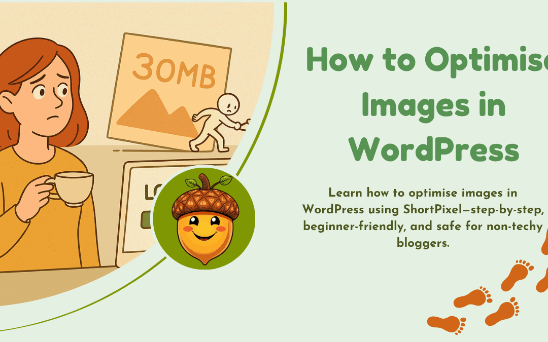
How to Optimise Images in WordPress
Or, How to Optimise Images in WordPress (Without Breaking Anything))
Optimising thousands of images sounds terrifying—but with the right plugin, it doesn’t have to be.
When I first started working on my site’s speed, I had no idea how much my images were slowing things down. I thought I was being careful—but it turns out, my Media Library was a bit of a digital attic and we all know how cluttered the attic can be!
So this week, I finally tackled it.
Here’s how I optimised over 4,000 images using ShortPixel Image Optimiser, a beginner-friendly WordPress plugin that now quietly works in the background to keep my site fast and tidy.
Why I Needed to Optimise My Images
-
My homepage was feeling sluggish
-
Google’s PageSpeed scores weren’t great
-
I’d uploaded images for years without compression
-
My site had multiple versions of every photo (thumbnails, medium, large)
In short, things were heavier than they needed to be. (A bit like me!!)

What I Did (Step by Step)
Here’s how I did it—no drama, no disasters:
-
Installed the ShortPixel plugin
-
Signed up at shortpixel.com and got my API key
-
Pasted the key into the plugin settings on my site
-
Chose “Glossy” compression (great balance of quality + speed)
-
Turned on Background Mode so it could run quietly
-
Bought a one-time credit pack (mine had 30,000 credits—more than enough), You get 100 credits a month so usually you don’t need to purchase any extra but because I was trying to optimise all the images on my site all at once I decided to buy the extra credits so I could finish the job.
-
Clicked Bulk Optimise and let it do its thing!
It worked in the background while I got on with other things. No crashes, no chaos.
What About the Errors?
Yes—ShortPixel told me there were 127 “errors.” But when I looked closer, most of them were:
-
Duplicate thumbnails
-
Image sizes I don’t even use
-
Skipped files already optimised before
None of them broke anything. They didn’t stop the rest of the site from becoming faster and lighter. So—no panic needed. Phew!
The Results
-
My site loads faster on mobile
-
Pages feel smoother and more responsive
-
I don’t have to worry about uploading “too big” images anymore
-
Best of all? It’s one less invisible task on my to-do list
Would I Recommend It?
Yes, absolutely—especially if you’re not technical and just want a plugin that handles things quietly in the background.
You don’t need to understand all the jargon. Just pick ‘Glossy’, let it run, and enjoy a lighter, more professional-feeling site.
And Finally...
If you’re new to this and feeling overwhelmed, don’t worry—I’ve been there too.
Leave a comment below or drop by my Start Here page.
I’m always happy to walk through it with you, step by step.
Now… off to bed for me. 😴
And if you’re still reading this late at night—maybe it’s time to tuck in too.
The internet will still be here tomorrow. Your peace of mind matters more.
Here’s a little transparency: My website contains affiliate links. This means if you click and make a purchase, I may receive a small commission. Don’t worry, there’s no extra cost to you. It’s a simple way you can support my mission to bring you quality content.